Design your Paywalls-Latest
Paywall Builder
Our new Paywall Builder has been released with and improved navigation to ease the set-up. It also includes the opportunity to upload device specific image to improve the experience for your users.
We have set a series of article to help you understand and navigate the new console to build and manage remotely and without a need to resubmit your App first class paywalls.
Furthermore this release is the opportunity to bring more flexibility and advanced features to develop interactive and reactive interface to promote your products and ultimately improve your conversion funnel. Let's dive in
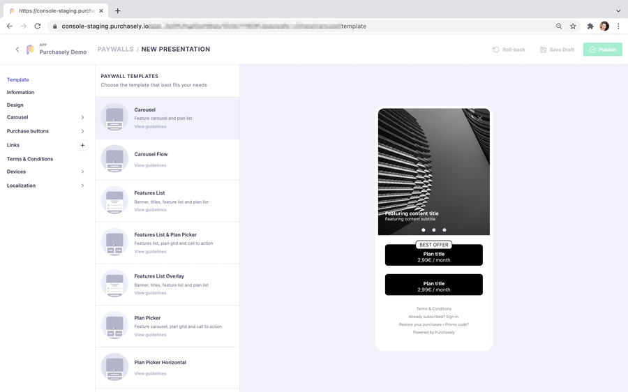
Available templates
We currently have 8 tested and approved templates, inspired by the best in class Apps, to choose from and tailor to your App specific needs.
We will shortly introduce them here and by clicking each name you will be taken to the details of setting up that specific template and in which circumstances it is best used (and some inspiring examples)
Not finding the Template you are dreaming of for your own App? No worries, the good news with this new Template Builder is that we can develop a new one fast and to your needs. Get in touch with our team to know more about this.
Paywall Parameters set-up
The following section gives an introduction and overview of the Paywall parameters shared by all templates and minimum information required, along with the expected behaviour.
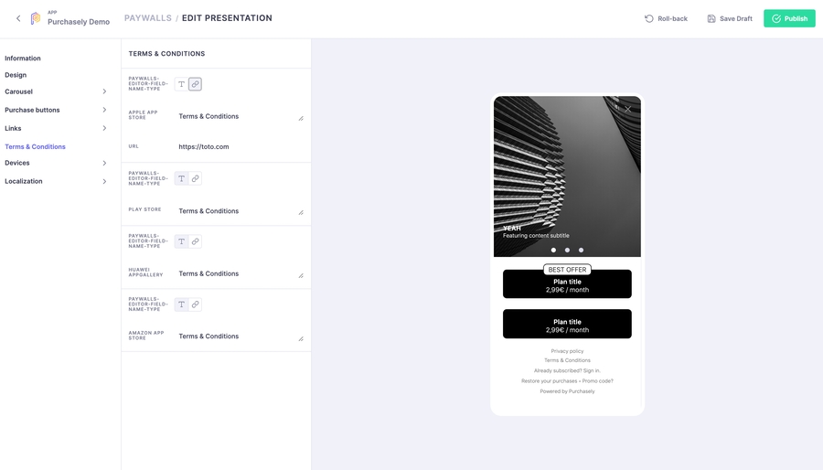
The builder is divided into 9 areas :
- Information
This is where you set the name and vendor_id of the Paywall\
NAME : the name displayed in the Paywall list ⚠️ - Make sure to Publish the Paywall for these changes to be taken in account and getting displayed in the Paywall List Overview\
VENDOR ID : This in the internal ID you can use for calling specific Presentation\
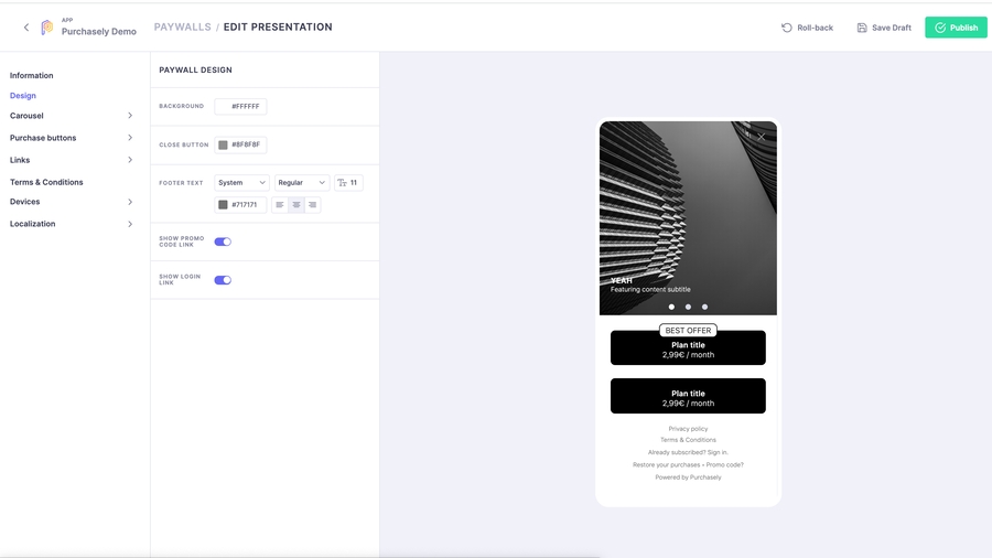
- Design
This section relate to the basic set-up of the Paywall\
BACKGROUND : set the screen background HEX colour for the Paywall
CLOSE BUTTON : set the HEX colour for the Close button to dismiss the Paywall
FOOTER TEXT : choose and format how the Footers appear in the Paywall
Pick the font (you can upload your own Custom Font)
Set Font size
Format text positioning
- [Selected Template Name]
This section relate to all Content Management for the presentation of your offers and details on the product.
Each template has a different set of parameters. Please check the individuals templates for the specifics, they contain :
Header (all templates except for Carousel)
Image and video
Text
Icons\
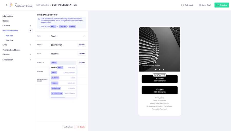
- Purchase buttons OR Pickers
Theses sections will allow you to display the different plans levels and prices, includes formatting.\
Depending on the Template you have initially selected, plan presentation will either be considered to be a Purchase button or Picker. The difference lies with UX :\
Purchase button, one click purchase. No additional CTA is displayed. Click on the Plan button will directly initiate the Purchase.\
Pickers, 2 click purchase. Click on the button will select the Plan. Purchase gets finalised using the CTA
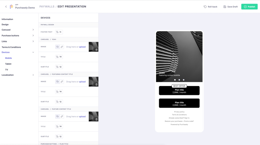
- Devices - NEW
With this release comes the opportunity to serve device specific visuals to ensure the best display and User experience. We offer adjustments around 3 device types :
Mobile Tablet TV\
You can readjust there all parameters of Paywall and Purchase Buttons
Image and Video
Font Size
Content
Borders
By Default, if not amended, the 3 devices will use the general set-up you defined in the previous sections.
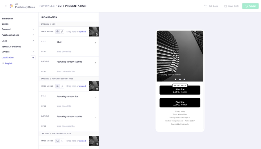
- Localization
Purchasely supports 17 languages. This is the section where you can localize your Paywall.\
Click on the ➕ to add a new language
Adjust the Content, including the images if they integrate text
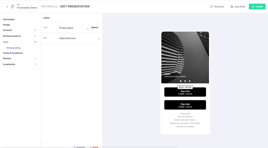
You can also adjust Links redirects to match domains
\
Last updated
